Concordia University of Edmonton (CUE)

Concordia University of Edmonton is a publicly-funded independent academic institution in Edmonton offering arts, science, and management undergraduate degree programs, as well as graduate degree programs in education, information technology, information security, and psychology.
Project:
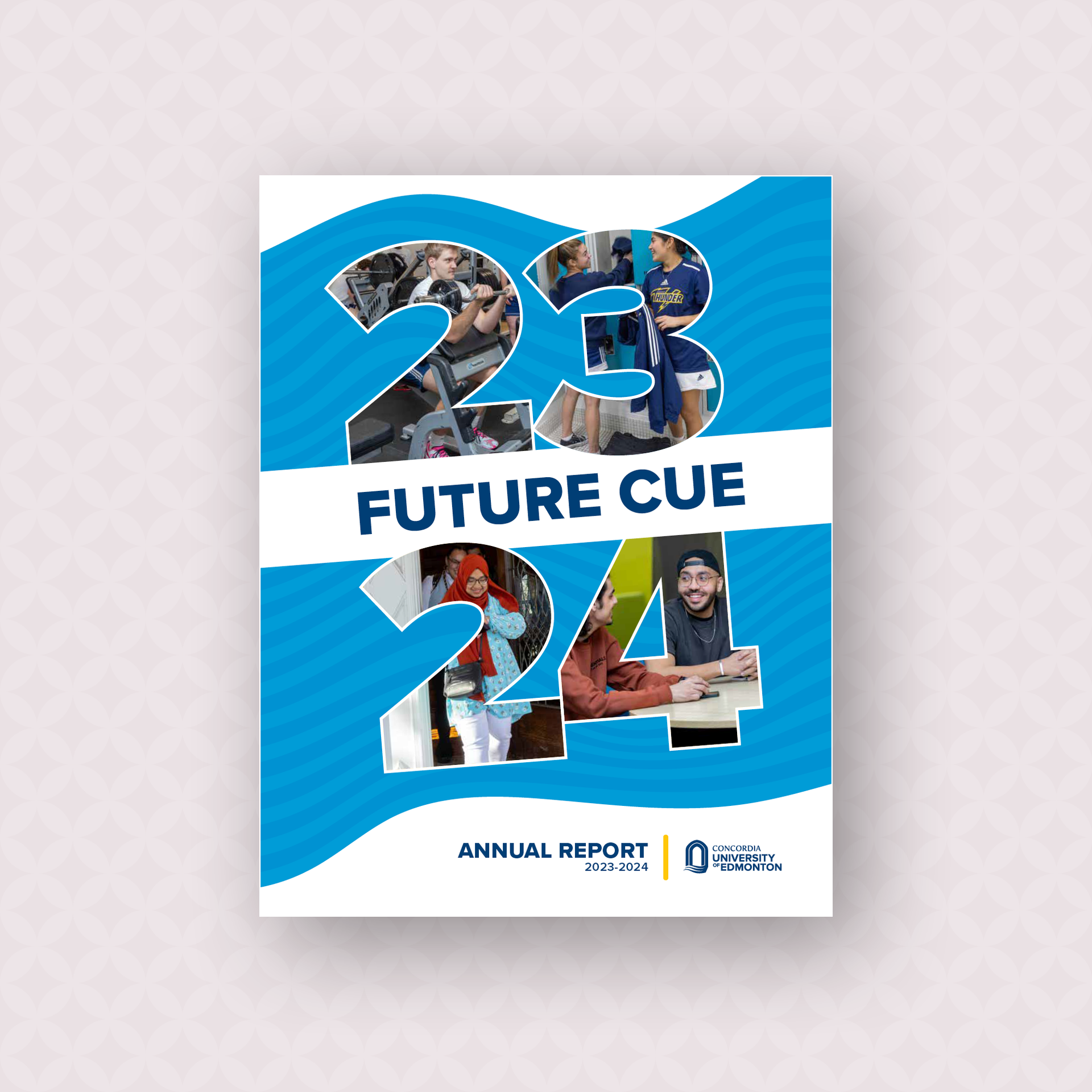
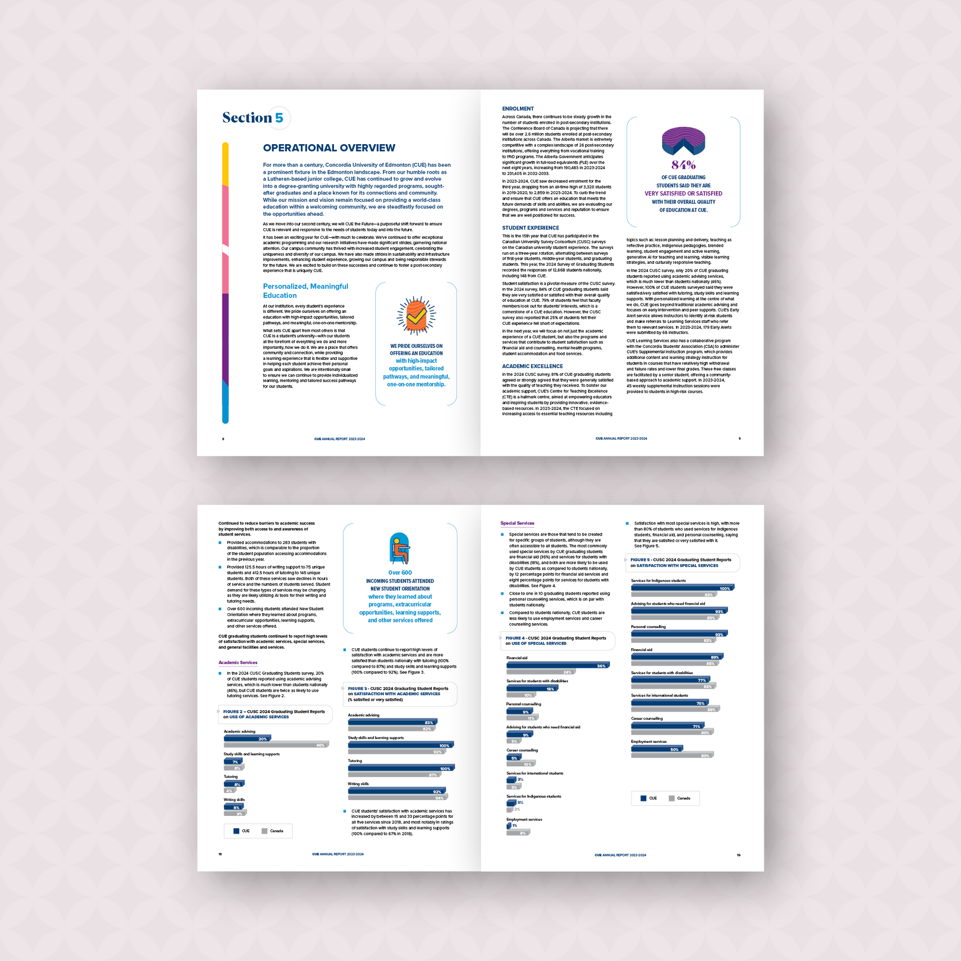
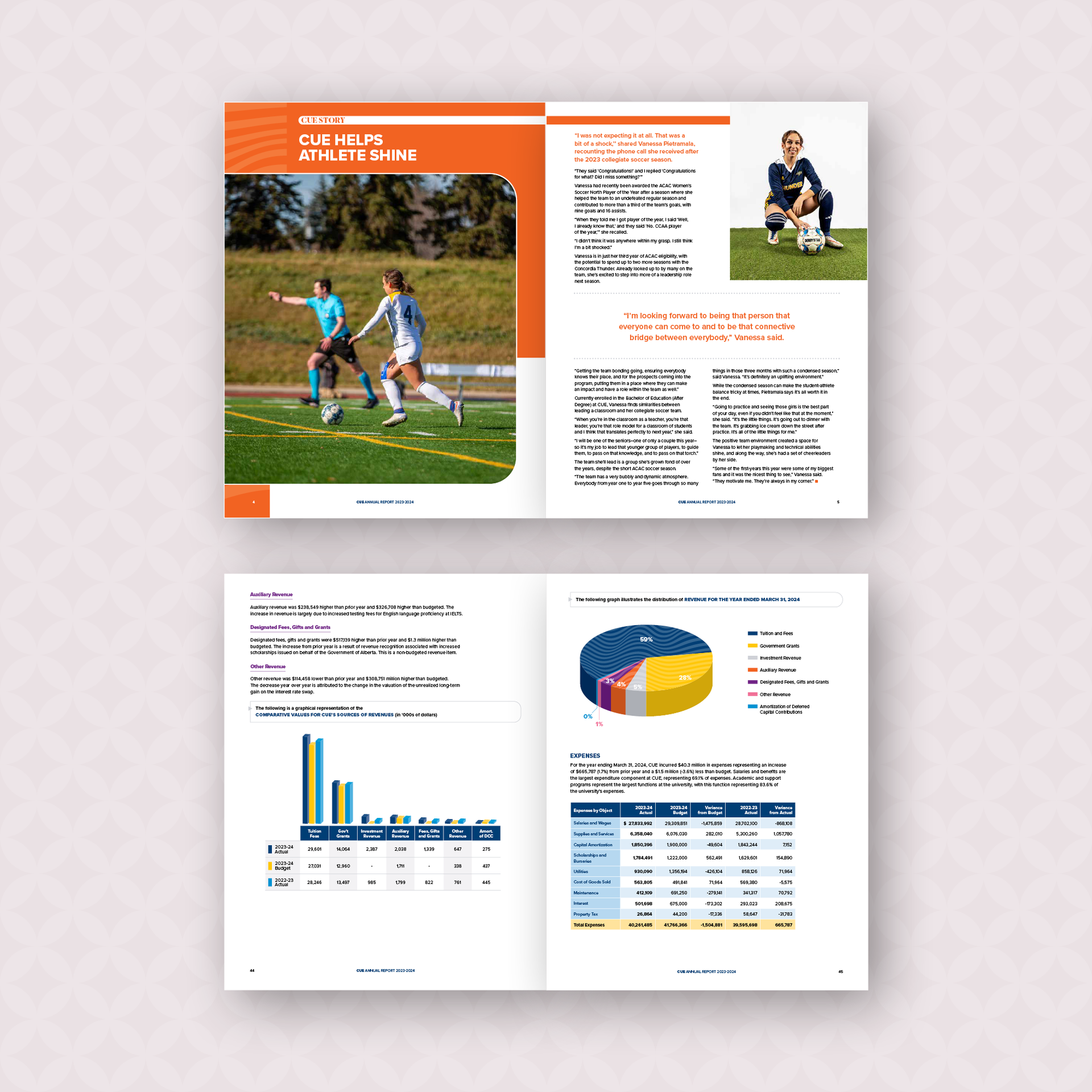
Annual Report 2023-24
Details:
CUE was looking for a re-designed annual report to help showcase the growth and vibrancy of the institution. The design for the report was inspired by elements of their logo and their environment, notably the large arched building entrance and the river valley.An arch graphic and wave pattern were introduced to highlight all photos, pulled quotes, pie charts and graphs, along with a suite of icons for callouts. Using the updated, vibrant colour palette for CUE made the report very visually fun and appealing.
Deliverables:
Digital report
Project:
Wordmark and Icon
Details:
To help expand the CUE brand and to further show of the institution’s growth and vibrancy, a new wordmark and icon were developed for use as a secondary mark to represent the University.Using the acronym CUE to describe themselves, a mark was developed inspired by the Edmonton’s river valley which they overlook. A wave was incorporated into the letters using the new main brand colours.
The icon is the version used for various web and social media platforms, encased in a circle to make the wordmark a focal point and to give it strength and visibilty on social media.