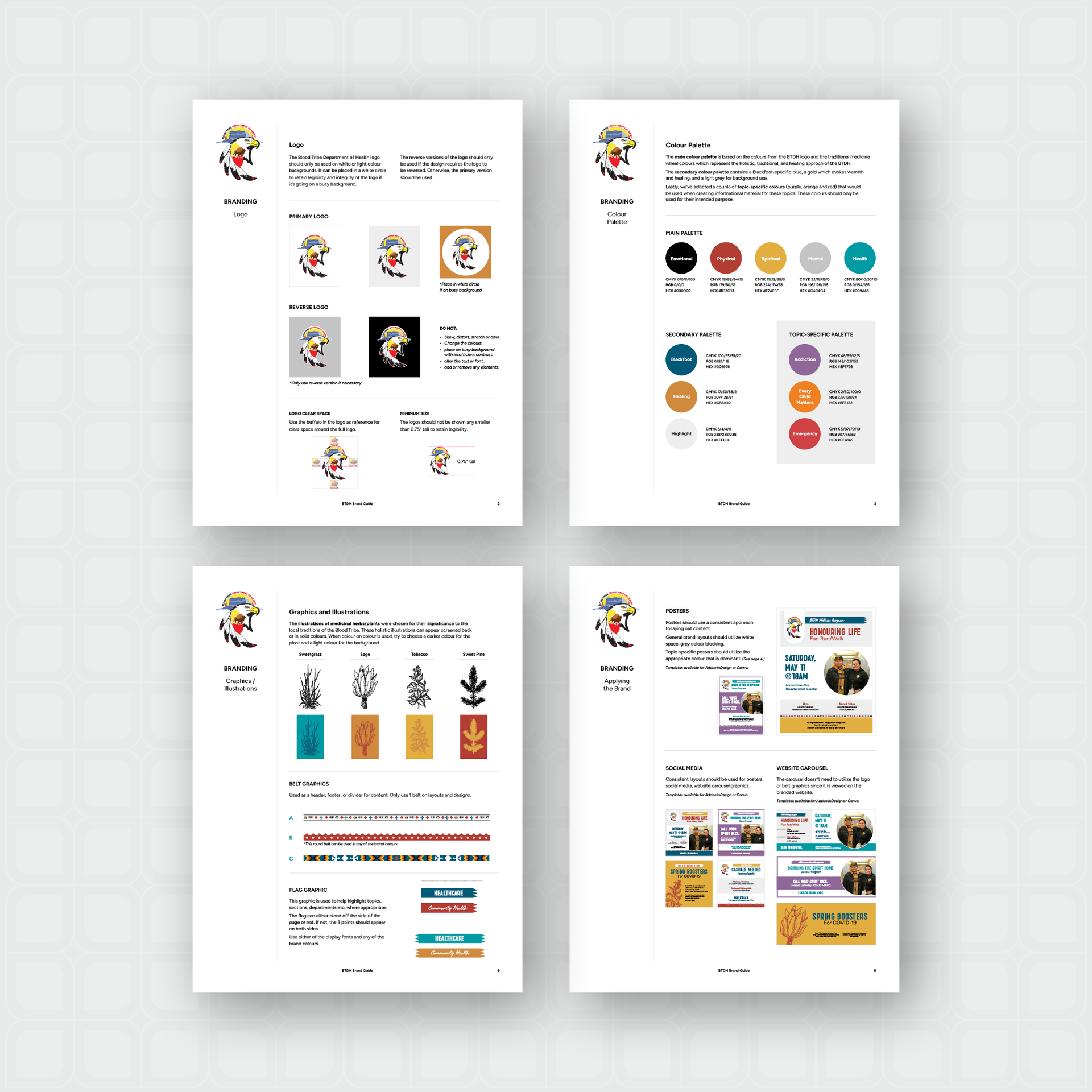
The BTDH required an updated and redesigned website. They had a designed logo, but needed a brand developed to provide a consistent look across all communications. A brand package was developed prior to beginning the website design and development.
The brand package included a colour palette, complimentary graphics, and selected typefaces that would express the desired feel of the BTDH - holistic, traditional and healing.
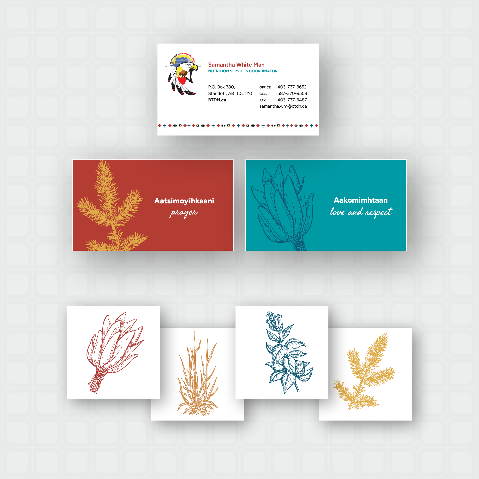
The main colour palette is based on the colours from the BTDH logo and inspired by the traditional medicine wheel colours which speak to the feel of the new BTDH brand. The secondary colour palette contains a Blackfoot-specific blue, a symbolic healthcare teal, and a gold which evokes warmth and healing. Lastly, several topic-specific colours were included for use when creating informational material for these specific topics.
Illustrations were developed of medicinal herbs/plants that each of the colours on the colour wheel represent and three custom illustrated landscapes that could be used as footer graphics or a ‘watermark’ for their communications. Belt graphics were recreated with updated colours from previously created graphics that would be used as a secondary element and when discussing the organization’s missions and values.