Blood Tribe Department of Health (BTDH)
The mission of the BTDH is to improve, promote, and deliver accredited health services on the Blood Reserve and support Chief and Council in ensuring the protection of treaty health rights.
Project:
Branding
Details:
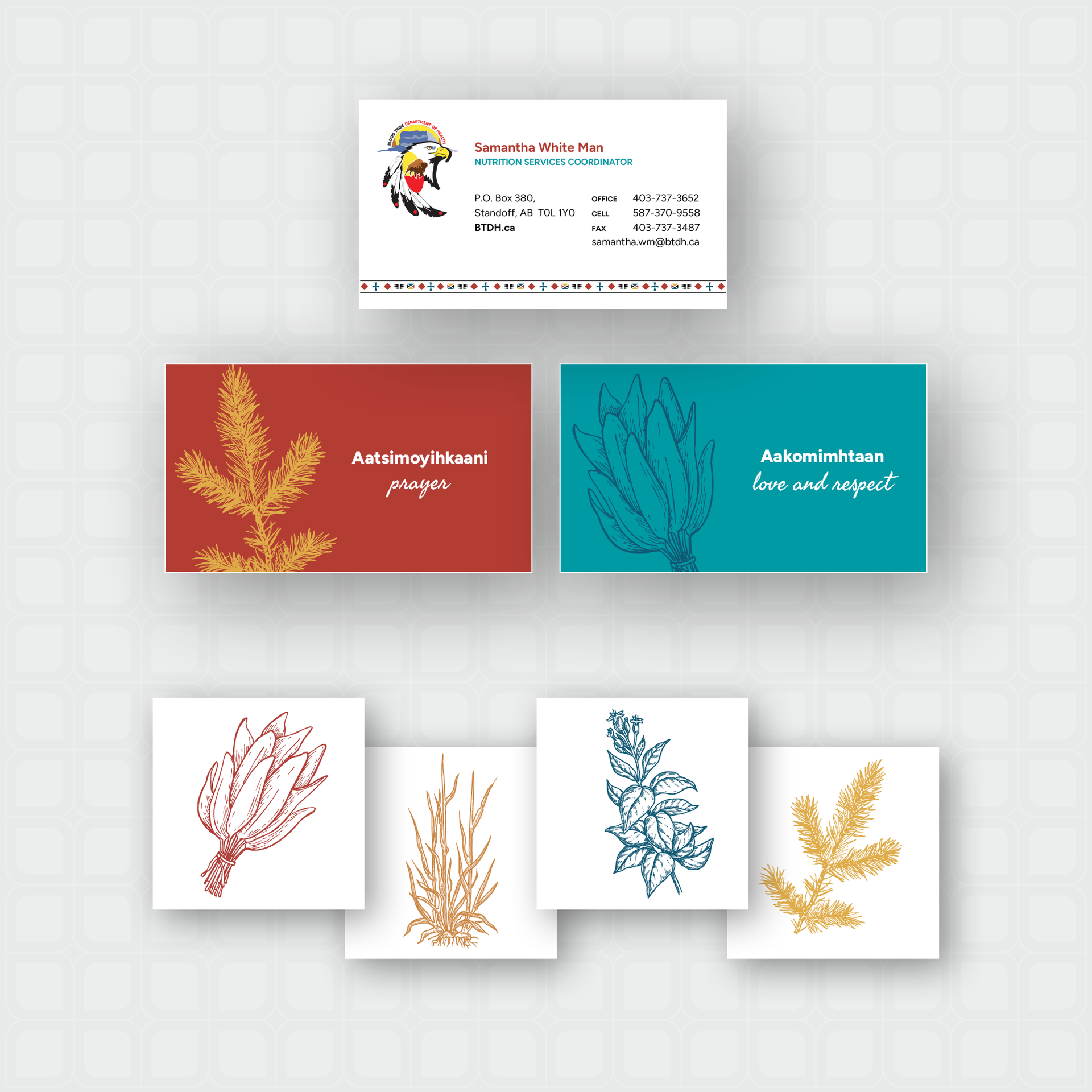
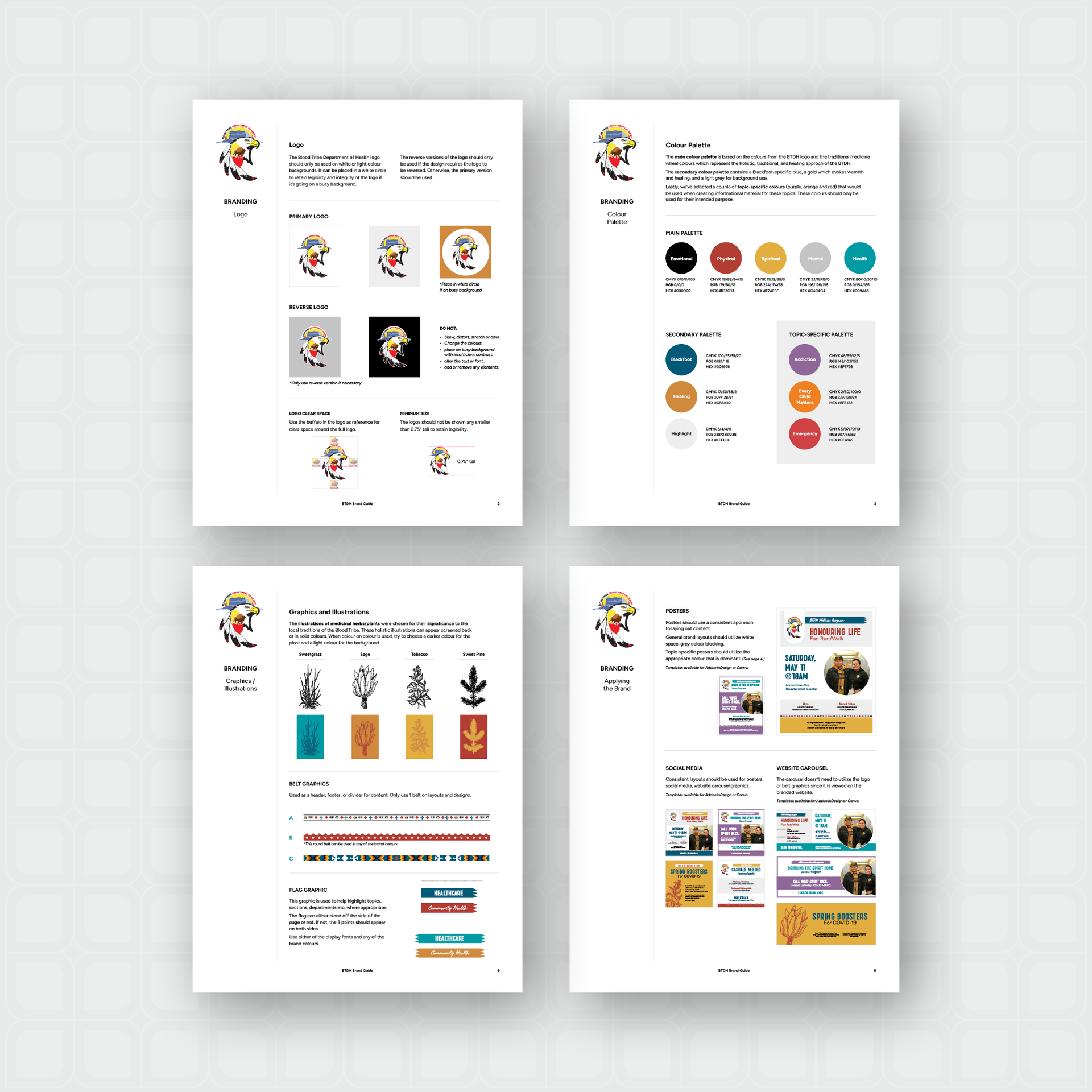
The BTDH required an updated and redesigned website. They had a designed logo, but needed a brand developed to provide a consistent look across all communications. A brand package was developed prior to beginning the website design and development.The brand package included a colour palette, complimentary graphics, and selected typefaces that would express the desired feel of the BTDH - holistic, traditional and healing.
The main colour palette is based on the colours from the BTDH logo and inspired by the traditional medicine wheel colours which speak to the feel of the new BTDH brand. The secondary colour palette contains a Blackfoot-specific blue, a symbolic healthcare teal, and a gold which evokes warmth and healing. Lastly, several topic-specific colours were included for use when creating informational material for these specific topics.
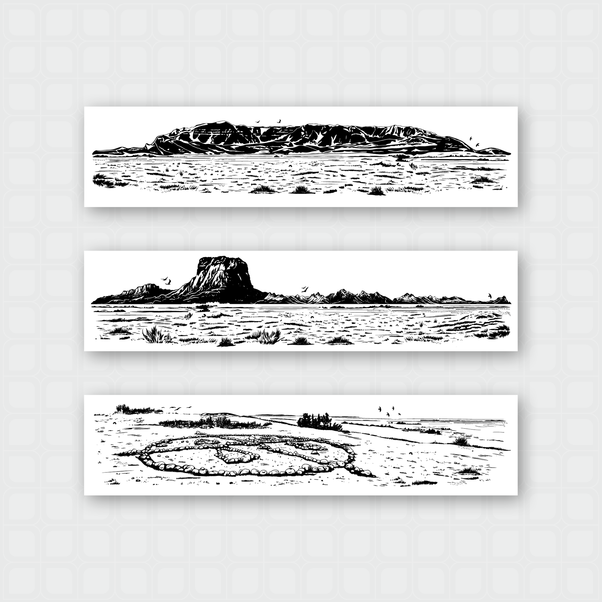
Illustrations were developed of medicinal herbs/plants that each of the colours on the colour wheel represent and three custom illustrated landscapes that could be used as footer graphics or a ‘watermark’ for their communications. Belt graphics were recreated with updated colours from previously created graphics that would be used as a secondary element and when discussing the organization’s missions and values.
Deliverables:
Brand Guidelines, graphics and illustrations, various templates (letterhead, business card, social media, and poster)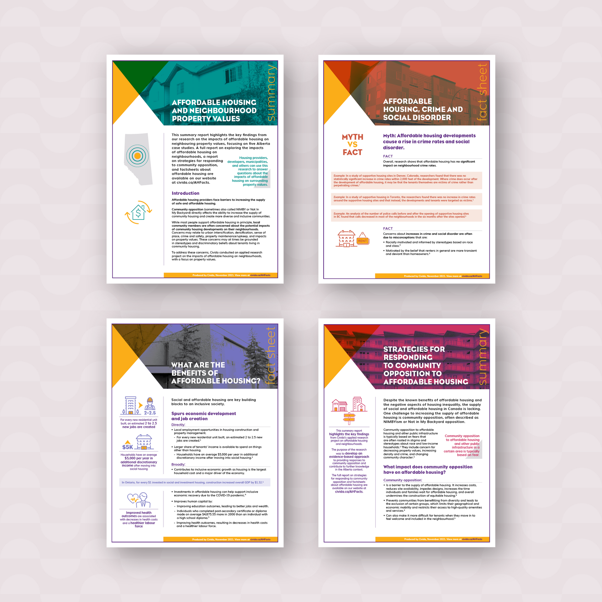
Project:
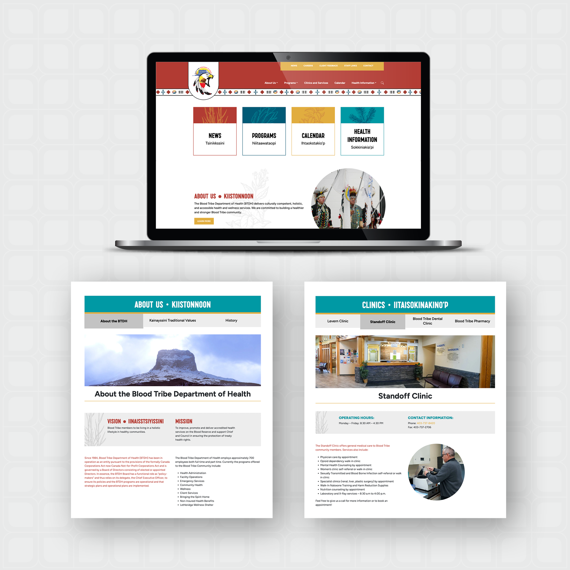
Website btdh.ca
Details:
Once the branding was completed for the BTDH, the website was developed using the various graphics and illustrations to create a visually bright, bold site that showcases the organization and is reflective of the traditional values of the Blood Tribe.The site needed to host a large amount of relevant information for the community – from programs, clinics, and specific health information, to organization governance, staff only links and calendar events. The main goal was to create a site that was easy to navigate, access important information, and make updates.